Showing posts with label Texture. Show all posts

Thursday, June 7, 2012

amazing in black and white...


I am loving this black and white with the added texture of baskets and woven pieces.  So simply fabulous.  I think it takes a certain level of control to keep to a wonderful color scheme like this and to make it work well.  Love love the striped rugs!

images via

Photobucket 

Thursday, November 17, 2011

Thursday tip # 9 - small rooms

Thursday tip # 9 - small rooms

Stamford Bedroom Detail traditional bedroom
Hugh Jefferson Randolph Architects

There are many options when one has to decorate a small room.  These ideas are built on the principle of keeping all aspects of the decor as minimal and connected as possible. Since this is the look I prefer in any room, small rooms are never a challenge and I even prefer them. 
  • choose a monochromatic colour scheme (as above), or a neutral one with pops of colour
  • keep accessories in one colour range (in this room it's brass)
  • use multipurpose furniture ( stacking tables)
  • consider adding a shelf for storage/display to move things  off the floor
  • use multipurpose accessories (lamp that looks like a sculpture; interesting mirror instead of art work; beautiful boxes that can be used for storage
  • use many textures instead of bold patterns (in pillows, window treatments)
  • use furniture that is in proportion to the room
  • keep the lines of larger pieces simple
  • when choosing artwork focus on one striking piece and have anything else play a supporting role.  
  • use strong verticals to move your eye up (long drapes, vertical art work, tall slim lamps)
  • use your window as a backdrop for the placement of a prominent piece of furniture (bed i or chair)

Thursday, November 10, 2011

Thursday Tip # 8 - make it white

Coastal Living

There is something so soothing about a monochromatic colour scheme.  I have friends who would say boring not soothing. but to each his own.  It might seem easy to have a room is varying tones of one hue but not so.  It's even more difficult to design a white room to look interesting.  The trick is to emphasize shape and texture through repetition above all else. Don't forget that there are hundreds of whites with varying undertones and temperatures.

Why does this room work?
  •  white shows up all the textures and lines in the room;
  • the small mirrors arranged in a grid add a strong repetitive element and each looks like a small painting because of the reflections from outside (I'm assuming); that adds optical texture;
  • the walls are horizontal boards which play against the square mirrors;
  • apart from the texture of the white boards, the horizontal lines are soothing and are repeated in the cabinet below: 
  • the arrangement has various shapes( cones, spheres, stars) and surfaces (reflective, matt, rough, smooth);
  • shiny surfaces add an unknown quality because you never know what will be reflected;
  • the whites are on the warmer side and a little "dirty" which doesn't look stark.
Here are several other white rooms.  Do you think they are successful? What do they have in common with the room above?

Elle Decor


Marcelo Brito - Sao Paulo - Brazil contemporary dining room
Marcelo Brito


Which do you prefer? 

Thursday, October 20, 2011

Thursday Tip #5- Use geometry

Thursday Tip #5- Use geometry

rosettes  living room

Most  furniture  is predominantly rectangular.  When you're adding accents it's good to include circular shapes to play against the strong horizontal  and vertical lines. The basket, table, wooden goblet and  medallions work wonderfully with this sofa (which is not as squared off as most).  There's also lots of texture in this room. If you can't count at least five different textures in a space it is probably not that exciting!  You rarely see beige paired with yellow, but doesn't it look fabulous? In case you didn't notice.... spray paint medallions meant for ceiling applications and use them as wall decor.

Sunday, August 7, 2011

Magnificent Wood Veneer Texture Little Cute Coffee Table

Magnificent Wood Veneer Texture Little Cute Coffee Table

Magnificent Wood Veneer Texture Little Cute Coffee Table - House Interior Exterior Furniture Design Idea on House Design Idea HomeAboutArchivePrivacy PolicySitemapHouse Design IdeaHouse Interior Exterior Furniture Design Idea « Hottest Cozy Comfy Rocking Modern Chair | Shiny Smooth Extra Large Luscious Lavish Backrest Bathtub »

Magnificent Wood Veneer Texture Little Cute Coffee Table

little cute splice lounge table
This little cute coffee table is epithet Splice and be shaped through Fred Rieffel. This table can be transforming it rotary the plate’s orients as you feel like the plate’s table is created from oak wood veneer texture, the dimensions are 124 x 23 x 86 cm. The plate’s orients move and metamorphoses of shape are the entire according in the direction of your feel. The plate’s table is eco-friendly as completed of original oak wood and its modern stylish table. The stylish lounge table would appear grand not just in contemporary interior but besides in a lot of others interior style. Simple stylish, it’s offered in 10 texture types of natural wood. via
magnificent splice rotary table
Splice plates coffee table

Sponsored Link

Monday, June 27, 2011

Take a closer look


 The room above works because of its mix of various materials with a neutral palette.   I kept returning to  beauty comma  to look at it over several days.  When you are drawn back to a room it is worthwhile to examine what aspects of it you like.  That was easy for me in this case- everything. 

Why does this room work in my view?

  • blond woods are my favourite and have always been since I was in my twenties- no ebony or mahogony for me. I like my wood to integrate with the other elements in a room, not stand out. I like to use wood for its texture, not colour.
  • clean lines allow your eyes to move over an object and  on to something else.They create visual flow in a room which works to create a  relaxing atmosphere.  Boxy is better in my view because these lines seem to fit/follow the envelope of a room .  Rectangular shapes can be softened by  accessories and softer textiles.
  • sculptural shapes  are added in the lamp, vases, boxes  and rock like structures in front of the window. There are other shapes hiding. Have a closer look. The selection of these accessories were not done in haste because they play perfectly with each other. This room depends on sculpture as an art form.  Notice there are no two dimensional art pieces on the walls. 
  • variety in  textiles (pattern, texture) is a must to support a mainly monochromatic room. The play of the striped rug  against the furry one  is wonderful. 
  • the absence of jarring colour makes this room a calm retreat.  It is a room I could spend many hours in and still find it interesting because of the texture and shapes.  Less is always more in colour. 
  • bringing the outdoors in by minimizing window treatments and utilizing the glimpses of nature as art.
What about this room in comparison?


It has many of the characteristics noted above but a much darker palette.  Texture and sculptural forms are dominant.

Matt Costigan via Decoria

Friday, June 24, 2011

Style like a pro -Texture


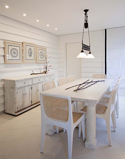
 Colour is the most obvious element in interior design because of its boldness or starkenss. Homeowners constantly update their rooms with colour changes, but what about all the other design elements?  For example, have you given your room a texture update lately? Texture is simply using a variety of  finishes in a room and it is easily improved by varying the composition of products in a room, e.g., glass,  woods, metal, plastic, cotton, velvet, lacquer, leather, ceramic. etc. Stop and look around you. How many different materials have you used in your room? What's your room's texture quotient? 

  Texture is the element that gets constantly overlooked  because its effects are subtle. It's one of those things that you take for granted when it is done well, but it's difficult to identify if it isn't , You just know the room looks boring, but you're not sure why. Layering textures gives a room interest and depth.

Jessica Helgerson  a Portland, Oregon  designer, is a master of texture. Many of her designs, typically clean and uncluttered,  rely on the richness of textures for visual interest. 


This mid-century modern split level ranch house takes on a new life under her skillful direction. The overall feeling is restful and outdoorsy. Furniture choices reflect the style of the home. The vintage finds were reupholstered  in light fabrics of varying textures. The coffee table made from salvaged maple is the center piece of the room. Its irregular edges and smooth surface plays well with  the Portuguese eel traps hanging over the fireplace mantel . Glass is prominent in the French demijohn bottles and ceramic Chinese garden stools are tucked into the room.  The woven area rug stands out against the smooth ebony floors.


At the end of the living room, the dining area continues the themes already established. You get a clearer view of the ceramic Chinese stool and the raised texture on the pillows.  The leather chairs work well against the high gloss wood table.  Plants, vegetables and wicker all work to enhance the  this welcoming room.  Metal chair legs show up well against the ebony floors. Glass and ceramic are evident in this room too. One of the musts in texture usage is to play matte and gloss surfaces off each other with one being more dominant -usually matte. The textures and colours of the outside also play an important role in this room's success.


Continuing with the white and green theme, this high contrast  bathroom has a lot of texture punch for a small space, Wood, metal, marble, ceramic, glass,  paper, and fabric are blended seamlessly to produce a room that wows.

And now a little quiz... how many textures are combined to produce this stunning master suite?