It's never perfect
art arrangement colour schemes FurnitureThere's room for improvement in most decors because perfection is difficult to create and every set of eyes will see a design in a different way. I'm amazed by the discussion that ensues when several decorators look at the same photos of a project. Often an aspect of a room that I will focus on may be ignored by someone else or one of my colleagues will bring up an aspect of the design that I didn't even notice.
Look at each of the photos below and see how you feel about the decor. You will notice a general theme of art work running through my commentary.That's because I feel strongly that art work can make or break great decor. What do you think are the strengths in these rooms? Is there anything that bothers you? Is there anything you would change (add or take away) if you could? Or is the room just perfect in your eyes? Decide what you think and then scroll down to my commentary. Did we focus on the same strengths and things that could be changed to improve the overall design? Did entirely different things come to light for you? Remember it's opinion.
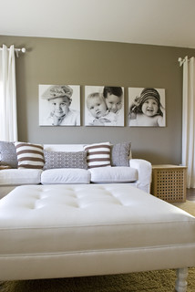
Number 1

A bed between two windows calls out for symmetry which this decor has. The colour scheme that supports the light wood tones is very soft and pleasing which I predict would make sleeping in this room pleasant and relaxing. Given the overall symmetry of the room, I find the artworks above the bed begging to be lined up with each other. Better still I would have just one piece hung since the second piece almost reaches the ceiling. I crave pattern for variety and it could be added in pillows , a throw and/or and with the addition of an area rug under the bed. I'm personally not fond of all the wooden furniture matching and think that something more bench like would work at the end of the bed. The lovely cabinet could be moved to another room.
Number 2

I like this neutral bedroom that just sings with the splashes of orange red on the bed and in the art pieces above it. Any art work arranged in a grid interests me, but this bed seems to need larger pieces above it. Even with the massing of smaller, brightly coloured works, the scale doesn't work with the bed. It's crying out for something with more visual weight. I bet there is another spot in this room where these pieces could be used to better advantage.
When choosing artwork for over a bed I like to see at least 2/3 of the linear space occupied. With a queen bed, I'd aim for two 18 x 20 or 20 x 20 inch works or one larger piece of approximately 40 inches in length. The higher the headboard the smaller the vertical measurement. Something brighter and larger in scale could be added to bring more visual interest to the bedside table that is visible. While there isn't much pattern in this room, the little bit on the pillows appears enough for my tastes.
When choosing artwork for over a bed I like to see at least 2/3 of the linear space occupied. With a queen bed, I'd aim for two 18 x 20 or 20 x 20 inch works or one larger piece of approximately 40 inches in length. The higher the headboard the smaller the vertical measurement. Something brighter and larger in scale could be added to bring more visual interest to the bedside table that is visible. While there isn't much pattern in this room, the little bit on the pillows appears enough for my tastes.
Number 3
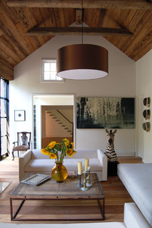
The elements in this room are quite interesting, especially the inclusion of the yellow flowers that are beautifully framed by the doorway beyond. The zebra is an unexpected touch and creates some pattern in this room which seems a little devoid of it. The two things I find jarring are the two pieces of artwork. I want to line up the small piece on the left with the chair under it and the large piece on the right is much too large for the space and looks awkward and squat. Sometimes this forced confinement of a work can be used to great advantage, but this work doesn't have that kind of imagery. I want to see it on a large wall which allows breathing room all around it. The brown light fixture is large, but it works because the room is vaulted and the dark colour connects with the wood on the ceiling.
Number 4
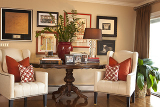
Many times in our homes we have to use the furniture that is available and arrange it to best advantage. I think the table is such a piece of furniture. It reads as just a tad too big to place between the two chairs, but thought has been put into creating visual flow with red to connect the disparate pieces and make the vignette look inviting. Your eyes have no choice only follow the pops of red that have been set up in the age old triangular format. My one great annoyance in this room is the plant that obscures the art work behind it. It is never a good idea to mount art work and then cover it up with the next layer of design. Perhaps it is only me who has this pet peeve; it might be the artist in me rising to the top.
IMHO... in my humble opinion. As I said, there's no one correct way to design a room and we all perceive a room differently. Do you have any reaction to these rooms?
![CrystalTech - [ Roger Hirsch Architect ] eclectic living room](http://st.houzz.com/simages/18675_0_8-9373-eclectic-living-room.jpg)